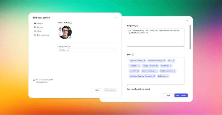
Today I embarked on a journey to upload a new Office 365 profile picture
Turns out, there’s many rules in Office 365 that determine which profile picture gets synced to where, and when. And there’s rules for those rules. I'm not sure what they are, but here's the journey I went on to upload a new profile pic in Office 365.
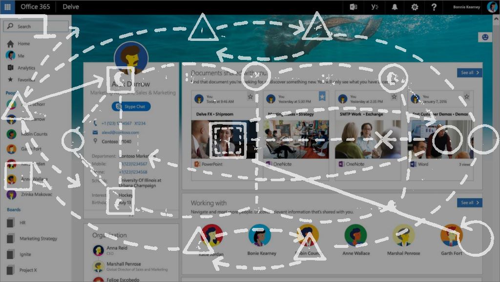
When I first saw Delve I was impressed. “Wow, this looks good!” I thought, “Microsoft is putting some serious work into their UI.”
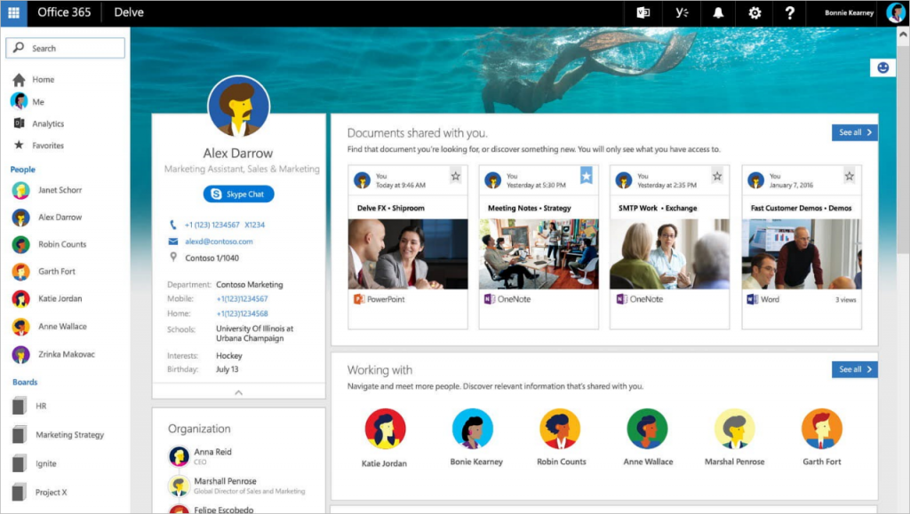
It was pretty. It seemed real easy to use. It looked… fun.
One of the standout elements on the Delve profile page is the user photo. It’s a bold, beautiful design element that draws your attention.
“I really love how they’ve done this,” I thought.
I was getting excited to see how the editing worked. “The new photo upload experience must be real slick!”
But my excitement faded real quickly.
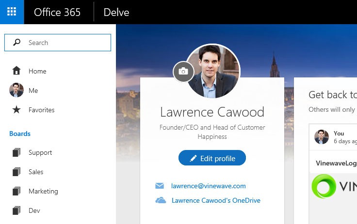
As I admire this design element, I notice my badly cropped picture and decide to change it. The camera button is begging me to click it.
So I hover over the button and…
Huh, what’s that?

Is that a speck of dust on my screen? I try to wipe it off. It doesn’t come off. It’s the viewfinder on the camera icon.
I make a mental note to never use a 1x1 pixel as a design element anywhere.
I click the camera icon.
What the? Did it just open a new browser tab?
I expected a simple lightbox or popup so I could upload my picture right there on the page like I do on Facebook and Twitter and any other modern web app including LinkedIn.
Instead, I find myself in the Newsfeed. Am I on the right tab?
I close the tab and click the camera icon again. Nope, still the Newsfeed. But the heading says Edit Details so perhaps this is right.
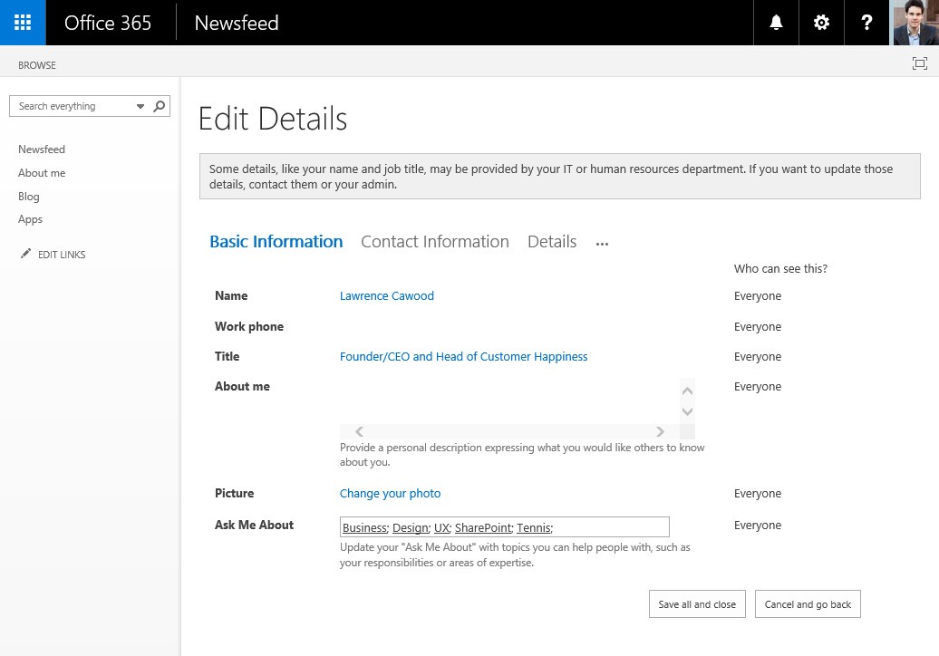
I search for a place to upload my photo. I don’t see my existing picture — which would be a handy visual indicator of where to upload my new pic — but I do notice a Change your photo link buried on the page.
That's strange. I had, just moments ago, announced a desire to update my photo when I clicked the camera icon.
I reaffirm my intentions by clicking Change your photo.
Another browser window opens. Really!?
Now I’m in Outlook.
This time it’s a popup window instead of a tab.
I try to remember what I was originally doing. Ah yes, I was updating my Office 365 profile picture.
At this point I decide to take a break and reflect on my journey so far. I note that I’ve got 3 windows open: two tabs, and one floating popup with scrollbars. I note that my profile picture is still the same.
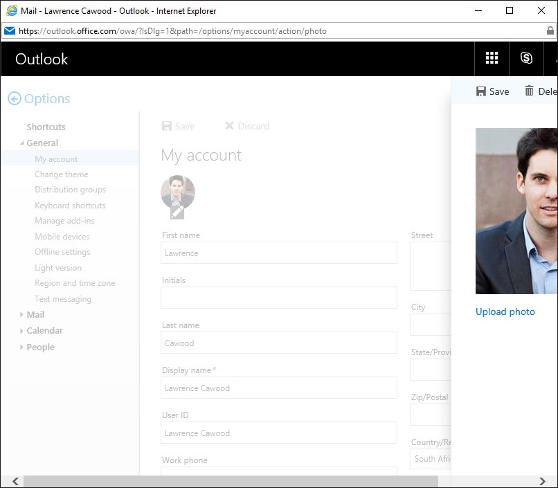
I see half my face and an Upload photo link that peeks from behind the badly sized popup window.
Hmm, I’m sure I’ve already indicated my intention to change my photo…
Again, I share my desire to replace my photo by clicking Upload photo.
Yay, I can choose a file!
I select one I’ve already cropped in Photoshop because I guess there’s no built-in crop tool here (there isn't).

The low-res progress indicator with the smudgy blue circles does its thing, then I click Save on the toolbar to seal the deal.
Hooray!
But I’m not done clicking yet. I have to clean up this mess.
I curse the scrollbars then close the Outlook popup. I close the interim Edit Details tab that served no purpose other than to get me to click a link to open another window.
I‘m happy now. I feel like a digital Columbus 🧭
I had set out on a journey, one that took me from Office Delve through the Office 365 Newsfeed to Outlook, and back again.
The only thing left to do is marvel at what I had just accomplished.
I navigate back to the original Delve profile page and hit refresh… because it’s 2016 and we need to reload entire pages.
As the page renders my smile slowly fades.

My picture hasn’t changed.
I refresh. Nope, still the old picture. CTRL+F5 refresh? Nope.
The profile picture in the Office 365 top navigation bar has been updated but the one on my Delve profile page hasn’t.
Did I go wrong somewhere?
In desperation I click my updated mugshot on the top navigation bar and notice I can change my profile picture there too.
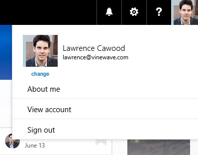
I click change to see what happens and I get another popup window.
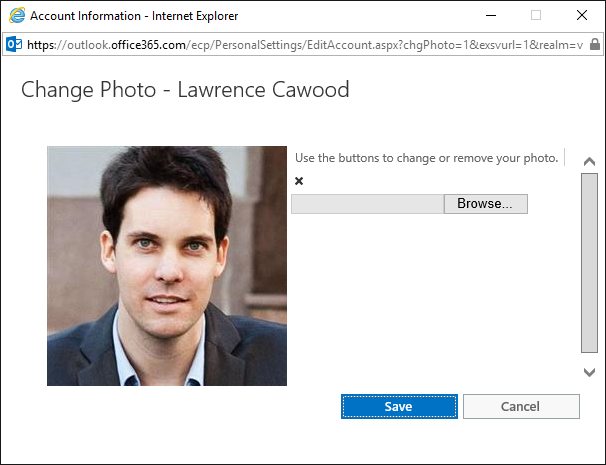
I've stumbled upon a second picture upload facility! Or maybe it’s the primary one, I'm not sure.
What I do know is this screen is ugly. It’s functional. But ugly. It’s fugly.
At this point I have more questions than answers.
- Why are there two completely different ways to upload a profile picture in Office 365? Are there more?
- Couldn’t the developers have simply opened this popup from the camera button on the profile page?
- Isn’t this used by millions of people around the world?
- Why does the X wrap to the next line? Why is nothing aligned? How did this UI get approved?
I choose a picture, click Save, and refresh my Delve profile page. The picture still hasn’t changed.

I make a cup of tea then dig up a blog post that says there’s 7 ways a user photo can be updated in Office 365.
Seven.
“SharePoint My Site, Outlook Client, Outlook Online, Lync Client, Yammer, Set-UserPhoto (powershell script), and DirSync (if synchronizing AD thumbnail images).”
The post is from 2014. There could be more now!
It turns out there’s also numerous rules that determine which profile picture gets synced to where, and when. And there’s rules for those rules.

So I give up.
Perhaps my old picture is okay.
When building software, it often takes a lot of engineering to create something really simple and elegant like a picture upload facility.
But where Office 365 gets it wrong here is that the end user has to share this burden of complexity with the web server.
Updating your profile picture is just one teeny tiny feature of Office 365. It’s minuscule compared the overall platform.
Yet you could write a 50-page user manual about the various ways to update your Office 365 profile pic and all the rules that accompany it.
This is not how it’s supposed to be.
Facebook has the same requirement: “The user must be able to upload a profile picture.” But they hide the entire complexity of their solution from the user, so the user doesn’t have to waste time figuring out how the app is supposed to work.
As we build our Office 365 people platform OneDirectory, we face similar challenges. In many cases it takes an enormous amount of effort to make something really easy to use. All those complexity-reducing things add up to create an overall user experience that feels cohesive and well-built.
As always, user experience is what matters most. Because regardless of how wonderful your app is behind the scenes, if it’s difficult to use, all that magic is squandered.

