Ultimate Guide to Organizational Charts – Structure, Tools, and Best Practices for HR & IT
Discover everything you need to know about organizational charts, from common structures and key benefits to essential tools and best practices. Ideal for HR and IT professionals, this ultimate guide simplifies creating clear and effective org charts.
Organizational charts are a visual roadmap of your company, showing who reports to whom and how teams fit together.
For HR and IT professionals, an accurate org chart is crucial for maintaining clarity, planning workforce changes, and improving communication. An org chart is a simple yet powerful diagram that outlines your company’s structure so everyone understands the reporting relationships.
But with so much information out there on org charts, it can feel overwhelming to figure out where to start. That’s why we’ve created this ultimate guide – to walk you through everything from the basics of org charts to tips on using the right tools and best practices to keep them effective.
In this guide, you'll learn:
- What an organizational chart is and why organizations use them
- Key benefits of org charts
- Common org chat limitations to watch for
- Main types of org chart layouts (hierarchical, matrix, flat, circular)
- How to create an org chart step-by-step using various tools
- Best practices for managing org charts (for HR & IT teams)
- Frequently asked questions about org charts
Let’s get started!
What Is an Organizational Chart?
An organizational chart (also called an organization chart, organigram, or organogram) is a visual representation of a company’s internal structure – essentially a snapshot of your organization’s hierarchy
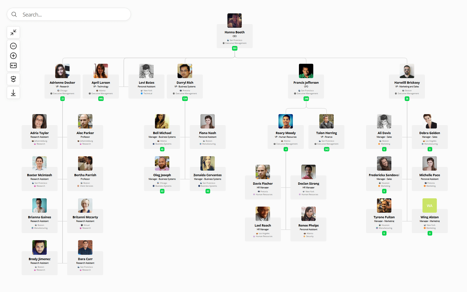
Typically, an org chart is drawn as a tree-like diagram with boxes representing individuals or roles and lines connecting them to show reporting relationships. For example, the CEO or top leader sits at the peak, with lines branching down to senior managers, their teams, and so on. In simplest terms, an org chart shows who reports to whom and how teams are organized.
The purpose of an org chart is to provide clarity and transparency. At a glance, anyone (employees or even outsiders) can understand how the company is structured and how different roles interrelate. It’s more than just boxes and lines – it’s a map of your organization’s working dynamics
Common elements shown on an org chart include departments, job titles, and the chain of command. Some org charts also include additional info like employee names, photos, or contact info to make it more informative.
Real-world example: Think of your org chart as the “family tree” of your company. For instance, if a new hire joins the Marketing team, the marketing org chart will show them exactly where Marketing sits in the overall organization, who the Marketing Director is, who the team members are, and how Marketing connects with other departments. This helps new employees orient themselves quickly. In fact, many HR professionals hand out an organizational chart during onboarding so new hires can put faces to names and understand the company structure from day one.
Benefits of Organizational Charts
Organizational charts provide several benefits for companies of all sizes. Here are some key advantages of using an org chart in your business:
- Improved communication: An org chart makes it easier for staff to know where to direct questions or updates because the structure clearly outlines the appropriate contacts and reporting lines.
- Easier onboarding: New hires can quickly familiarize themselves with the company’s hierarchy and key team members, which speeds up their integration into the firm. Instead of feeling lost, they understand “who does what” right away.
- Better planning insight: Org charts can reveal gaps or overlaps in the workforce. Leaders can spot if certain roles are missing or if some managers have too many direct reports, then adjust accordingly as part of strategic planning.
- Career path visibility: A well-structured org chart maps out potential career progression. Employees can see the hierarchy of roles and identify possible advancement paths or lateral moves, which helps in career development discussions and can improve morale.
In short, org charts enhance transparency and understanding. From top executives down to individual team members, everyone benefits from the clarity of seeing how the organization is structured.
Limitations of Org Charts (and How to Address Them)
While org charts are useful, it's important to recognize their limitations. A static org chart on its own may not tell the whole story of how your company works. Common limitations include:
- Only shows formal structure: Traditional org charts depict formal reporting lines but don’t show informal relationships or cross-team collaboration. In reality, people often work together outside their direct hierarchy – for example, consulting a mentor in another department or collaborating on interdepartmental projects – and an org chart won’t illustrate these unofficial networks. This means the chart can give a somewhat rigid view of the organization that might not reflect day-to-day workflows.
- Gets outdated quickly: Organizations are dynamic. People join, leave, or change roles frequently. A printed or manually maintained org chart can become outdated soon after it’s created. Relying on an outdated chart can cause confusion – for instance, contacting someone who is no longer in a role because the chart wasn’t updated.
How to Overcome These Common Org Chart Issues
Think of the org chart as a starting point, not a comprehensive map of all working relationships. Supplement it with other tools and information. For example, maintain an up-to-date employee directory with contact info and expertise so people can connect beyond the hierarchy. Encourage cross-functional communication so employees know they can reach out outside formal lines. And importantly, keep the org chart updated (or use org chart software that updates it automatically). By regularly refreshing the chart when roles or structures change, you ensure it remains accurate and useful.
Common Types of Org Chart Structures
Org charts can be drawn in different formats depending on how your organization is structured. Here are a few common types of org chart layouts:
- Hierarchical org chart: The classic pyramid shape, with multiple layers of management. The CEO or top leader is at the top, with direct reports below, then successive levels down to frontline staff. This format clearly defines the chain of command and is the most widely used.
- Matrix org chart: A grid-like chart where some individuals report to two (or more) bosses. For example, an employee might report to a department manager and to a project manager. This means some boxes will connect to two different managers. A matrix chart reflects a cross-functional structure and encourages collaboration across silos, but it’s more complex to read since some roles appear in dual relationships.
- Flat org chart: A chart with very few (or no) levels of middle management. Many employees report directly to a single leader or a small group of leaders. This layout shows a wide span of control – it emphasizes a low hierarchy, often used by small companies or startups. A flat org chart is easy to understand and enables fast communication, but it can become unwieldy as the organization grows (it might overwhelm leaders with too many direct reports).
- Circular org chart: A less common format where the traditional top-down hierarchy is shown in concentric circles. The top executives might be in the center circle, with the next level of staff in the ring around them, and so on. This format can imply a more egalitarian approach (everyone is near the center), but ultimately the relationships are still hierarchical. Circular charts can be eye-catching and emphasize teamwork, though they may be a bit harder to interpret at first glance.
How to Create an Org Chart (Step-by-Step)
Creating an organizational chart is much easier if you break it into steps. Here’s a straightforward process:
- Define The Scope and Purpose
Decide what your org chart will cover (the whole company or just a specific department?) and why you’re creating it (e.g. for internal reference, for onboarding, or to plan a reorganization). This will determine how much detail you need. - Gather Your Organizational Data
Compile a list of all roles and employee names, along with who each role reports to. Use your HR records or employee directory to ensure the data is accurate and up-to-date. Essentially, you want a clear hierarchy list before you start drawing the chart. - Choose Your Org Chart Creation Method (Manual vs. Software)
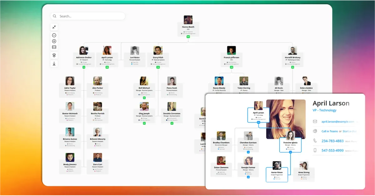
Select the org chart format that fits your structure (hierarchical is most common, but matrix might fit a dual-report setup). Then pick a tool to create it. For a small organization, you could use familiar software like Microsoft PowerPoint or Visio, or an online tool like Lucidchart. For a larger org or an always-updated chart, consider dedicated org chart software. For example, OneDirectory’s org chart software can generate your chart automatically from your HR or Microsoft 365 data (so it stays up-to-date in real time). - Design and Customize Your Org Chart
Start plotting with the top leader at the top (or center), then add their direct reports beneath (or around) them. Continue adding each layer of the hierarchy. Draw lines from managers to their subordinates to show the reporting links. Group individuals by team or department for clarity. As you build, double-check that the structure on the chart matches the list you compiled in step 2. - Refine and Maintain Your Org Chart
Adjust the layout to make it easy to read – align boxes, evenly space levels, and ensure names/titles aren’t cramped. Once it looks clear, share the org chart with your team (for example, via the intranet or as part of your onboarding materials). Finally, plan to keep the chart updated. Whenever someone new joins, someone leaves, or roles change, update the org chart accordingly. If you use an interactive or synced tool, these updates might happen automatically. Regular maintenance ensures your org chart remains accurate and trusted.
In summary, to create an org chart: gather your data, choose the right tool, build or import the chart, then share it and keep it updated. If you have a small org or love fiddling with design, manual might work; but for medium to large companies, an org chart software (especially one that ties into your HR/IT data) can save tremendous time and ensure accuracy.
(And yes, if it wasn’t obvious: we strongly recommend trying an automated solution like OneDirectory for ease of use. It’s literally designed to make org chart creation a breeze – what could take you hours in PowerPoint might take minutes with a smart tool. But we’ll let you be the judge!)

Best Practices for Managing Org Charts
Once your org chart is in place, keep it effective and up-to-date with these best practices (especially relevant for HR and IT teams who manage the chart):
- Keep it up-to-date: An org chart loses value as soon as it becomes outdated. Make a habit of updating it whenever there are role changes, team restructures, or new hires. HR can ensure personnel changes are reflected promptly, and IT can assist if the chart is integrated with your systems. Better yet, use an org chart solution that stays always up-to-date by syncing with your employee data – this automation prevents the “stale chart” problem.
- Make it easily accessible: Ensure everyone in the organization can find the org chart easily. Host it on your intranet or include it in your HR portal or directory app. When it’s easy to locate, employees (especially newcomers) can quickly answer questions about who is who, saving time and reducing confusion.
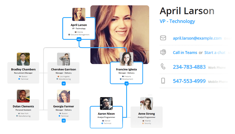
- Don’t overcrowd it: Keep the org chart focused on structure. Include names and titles (and maybe department names), but avoid cramming every detail into it. Detailed information like contact details or job responsibilities can live in an employee directory or individual profile. In fact, an integrated solution like OneDirectory lets you click on a person’s name on the chart to view their full profile instead of cluttering the chart itself. A clean, simple chart is easier for everyone to read. For very large organizations, consider breaking the chart into sections (by division or department) or using a zoomable interactive chart rather than a single huge diagram.
- Use it as a planning tool: Don’t treat the org chart as just a static document – use it in planning and discussions. For example, during succession planning, refer to the chart to spot roles that don’t have a clear backup candidate identified. During restructuring or growth conversations, use a copy of the org chart to sketch out proposed changes and visualize new reporting relationships. Incorporating the org chart into these processes ensures that any changes in structure are deliberate and transparent.
- Integrate with other systems: Where possible, connect your org chart to your other HR or IT systems for automatic updates. For example, OneDirectory provides a fully integrated org chart and employee directory – when HR updates a title or IT deactivates a user, the org chart reflects it without manual effort. This ensures everyone sees the same current information and adds context: the org chart shows the structure, while the directory reveals details like contact info and skills.
By following these best practices, your organizational chart will remain a living resource that adapts as your company evolves. HR and IT can collaborate on org chart management: HR keeps the content accurate and meaningful, while IT provides the tools and integration to make the chart easily accessible and automatically updated. Together, you’ll ensure the org chart continues to inform and support employees at all levels.
Conclusion
An up-to-date organizational chart is an indispensable tool for keeping everyone on the same page. It provides clarity about who does what and how teams are structured, aiding communication, onboarding, and strategic planning. By using the right tools and following best practices, you can make your org chart a dynamic asset rather than a static snapshot.
If maintaining the chart becomes time-consuming, consider modern org chart software like OneDirectory that can automatically generate an interactive chart from your existing data (so it's always current). This way, you spend less time updating boxes and lines and more time leveraging the org chart to foster transparency, collaboration, and informed decision-making in your organization.
Frequently Asked Questions about Org Charts
To wrap up, here are some FAQs that HR and IT professionals often have about organizational charts:
What’s the difference between an organizational chart and organizational structure?
Organizational structure is the actual way your company is arranged (hierarchy, divisions, matrix, etc.), whereas an organizational chart is the visual diagram representing that structure.
In other words, structure is the concept and reality; the org chart is how you illustrate it. An org chart should mirror the organizational structure. If you redesign your structure (say, move to a divisional model), your org chart will change to reflect that.
Who “owns” the org chart in a company – HR or IT?
It depends on the organization, but typically HR owns the content of the org chart (since it’s tied to people and positions) and IT often owns the tools or data that feed it.
HR usually takes responsibility for ensuring the org chart is accurate (because it’s closely related to job roles, reporting, and often compensation structures). IT might be responsible for providing the technical means (for example, maintaining the employee directory or supporting the org chart software, and ensuring data flows from systems like Active Directory).
In many companies, HR and IT collaborate: HR updates positions, and IT ensures the software (like OneDirectory or other systems) is working properly to display those updates. A good practice is to have a point person, often HR Operations or a People Analytics role, who coordinates org chart updates.
How often should we update our organizational chart?
As often as changes occur.
In fast-changing environments, that could be weekly! At minimum, review the org chart quarterly to catch any changes. New hires, departures, promotions, departmental shuffles – all should trigger an update. If you use automated org chart software, this is handled continuously (each change in your HR system is reflected on the chart in real time). If you’re updating manually, you might do small tweaks whenever someone sends an update, and do a full review at a set interval.
Never let an org chart sit untouched for a year – it will almost certainly be out of date. Regular maintenance is key to keeping trust in the org chart’s accuracy
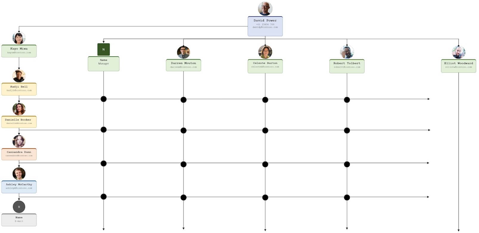
Can an org chart show multiple reporting lines (dotted-line relationships)?
Yes, many org charts will show a primary solid line (direct manager) and can also show dotted lines to indicate secondary or matrix relationships.
For example, an assistant might have a solid line to one executive and a dotted line to another if they support both. Or in a matrix structure, an engineer could have a solid line to the Engineering Manager and a dotted line to a Project Lead. If you’re making an org chart in PowerPoint or Visio, you can draw dotted lines manually to indicate these.
Org chart software often supports this explicitly; you might be able to tag someone as having a secondary manager or use a special notation. Use dotted lines sparingly – only where it’s important for clarity – so the chart doesn’t become too confusing. A note or legend can help clarify what a dotted line means in your chart.
OneDirectory’s org chart focuses on primary reporting lines (for simplicity in viewing), but because it integrates with profiles, you could include notes on a person’s profile about additional project supervisors, etc., which is another way to handle it.
What if our company is too large to fit on one org chart?
Extremely large organizations (think Fortune 500 with tens of thousands of employees) often break down org charts by divisions or departments.
It’s practically impossible to see an entire corporation on one chart. Instead, they produce high-level org charts of just top execs and major departments, and then separate charts for each division or business unit.
Another strategy is to use an interactive org chart that lets you navigate levels instead of printing it out.
For example, one could start at the CEO and click on a division to see the next level, and so on, rather than seeing all 50,000 employees at once. OneDirectory supports multiple org charts and the ability to search and drill down, which is ideal for large enterprises.
In summary, if it’s too large, slice it into logical pieces. Ensure each piece has a clear title (like “Sales Department Org Chart”) so people know what part of the organization they’re viewing.
Hopefully these FAQs clear up some common queries. If you have more questions, feel free to reach out – org charts might seem straightforward, but they can get nuanced as organizations evolve, and both HR and IT considerations come into play.